


28
Sep
17
Trends round-up: Decorex, Design Junction, 100% Design and London Design Fair 2017
We had a great week exploring the London Design shows, Decorex, 100% Design, London Design Fair (Tent and Superbrands) and Design Junction. It’s been an exciting year for new looks and colours and it’s always good to see lots of new ideas making their way through. We’ve picked out a few of our favourites, and trends we think work particularly well on walls and in a commercial environment. It’s a bumper edition, so keep on scrolling! We’ve also added a ‘Get the look’ section for each trend, click the links to see the products and order free samples.
The Colours

We’ve seen a number of trend reports hailing Powder Blue as the new key background shade. It was everywhere at the shows – on walls, soft furnishing and accessories. Paired with bright white, brass, painterly effects and blonde woods, the look is soft and contemporary.

Get the look (left to right): Loom, Watercolour Geometric, Shoji Screen, Sorrento, Strie

We weren’t expecting to say this, but Peach is our new favourite colour. Moving away from millennial pink, peach is the new shade to be seen sporting. Clean and unexpected it works brilliantly on walls, as well as furnishings, marble finishes, velvet, painted wood and ceramics.

Get the look (left to right): Terrazzo, Shoreline, Wave, Brushed Steel, Alan by Iona Crawford

Mint is the definition of clean, bright and fresh with a hint of vintage nostalgia. Update cool grey interiors with a splash of mint and pair with marble, velvet, gold and brass tones, geometrics, and lots of tropical greenery.

Get the look (left to right): Marble, Celeste, Ikat Grade by Ptolemy Mann, Tranquility, Marbled Paper Geo

From rich, more ginger hues to paler, almost pastel tones Olive is a refreshing move away from the acid Pantone colour of the year, Greenery. This warm, earthy shade works equally well in clean, minimal, contemporary applications and traditional interiors.

Get the look (left to right): Ridge, Harper, Workshop, Leaves, Harmony
The Looks

Perhaps slightly unexpected, the Decayed/Corroded look draws upon both the industrial/raw surfaces look and the laboratory/futuristic look we saw at Heimtex Theme Park this year. Think rust, chipped away wood, organic tones… absolutely summed up by Studio Lizan Freijsan‘s rugs at Tent (top left).

Get the look (left to right): Plateau, Agate, Rough Concrete, Rust, Bricks

Botanicals are shadowy and ethereal with lots of hand drawn and hand painted botanical prints, skeletal leaves and painterly effects. Also a few pressed flowers here and there. The palette is soft and inky with indigo blues, pinks, shadowy greys and olive greens.

Get the look (left to right): Watercolour Botanical, Leaves, Floral Geo, Limbs, Eden

This year’s Wood effects are all about the unique wood grain a greyed tones. Minimalistic styling, and paired with black and brass metals it’s a luxe look which we saw everywhere at Decorex. In contrast to last year we also noticed a lot of blonde woods.

Get the look: (left to right): Boston, Arbour, Sorrento, Omega, Malay

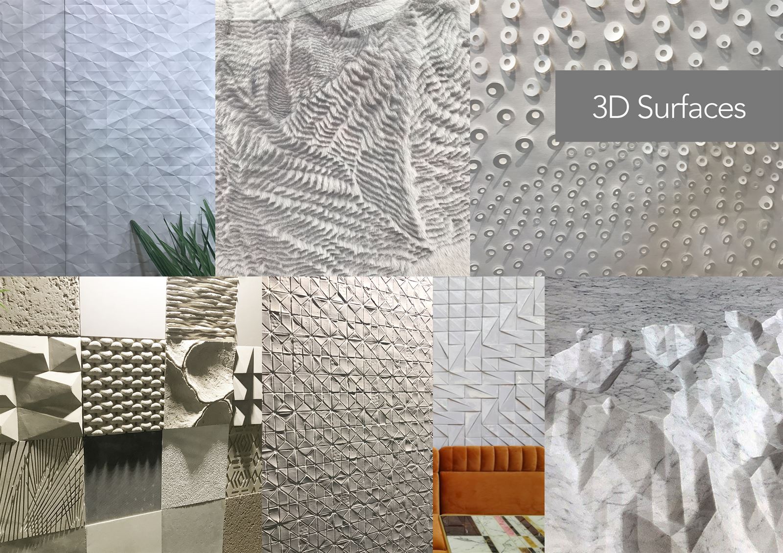
We can never get enough of self-coloured 3D Surfaces. This year we noticed the geometrics soften into folded paper effects and more organic and handmade effects coming through. Chunky textures and shades of white are key. We loved these tactile hand-made wallpaper designs by Alissa + Nienke (top right).

Get the look (left to right): Illusion, Sequins, Plateau, Interwoven, Cosmos
For more images and updates follow us on Instagram, Twitter, Pinterest and Facebook.