


30
May
18
Trends from Clerkenwell Design Week 2018
Clerkenwell Design Week may be over for another year, but our designers were thrilled to see four key colour trends featured in our 2018 Colour Trend blog on show.
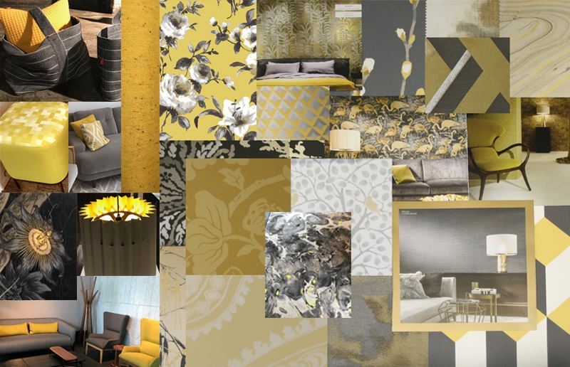
Cut the Mustard
Our predicated yellow and grey combination definitely “cut the mustard” at this years show. This perfect colour pairing works in textures, watercolours, ikats, geometrics and motifs.

Above: see how we’ve adopted this colour trend – Malay, Ptolemy Mann Chroma, Watercolours Botanical, Ptolemy Mann Ikat Grade, Patternistas Tern
Pretty Pastels

The royal wedding may have bought a touch of romance this May, but pretty pastels is an area we’ve been working on for a while. Here are our favourite five.

Above: see how we’ve adopted this colour trend – Patternistas Diamonds Dado Pink, Art Deco Concrete Tiles, Art Deco Arches, Baltimore, Art Deco Marble Tiles
Into the Blue

It may be over for another year, but this year we can celebrate having the “Clerkenwell Blues”. Deep inky tones to immerse the senses, striking designs delivered with ultimate style.

Above: see how we’ve adopted this colour trend – Artesia, Art Deco Block, Watercolour Tiles, Darnel , Leaves
Greenery

Pantone colour of the year 2017, greenery looks like its here to stay. This colour area is fuelled by our love of nature and the desire to bring balance to our surrounding.

Above: see how we’ve adopted this colour trend – Avidon, Patternistas Banshee, Iona Crawford Pasture, Patternistas Diamonds, Geometrics Lines
Read our 2018 colour trends blog, and discover the eight themes we predict will have the greatest influence in interiors this year.