


9
Jun
16
Trends report – Clerkenwell Design Week 2016
Clerkenwell Design Week is the UK’s leading design festival, and with the highest saturation of creative businesses and architects in the world, Clerkenwell was buzzing this year. The biggest names in the design world exhibit alongside emerging designers and artisans in various historical buildings in the area. Our design team spent the week exploring the show, and talking to the designers. Here’s what we found….
Inspired by Nature
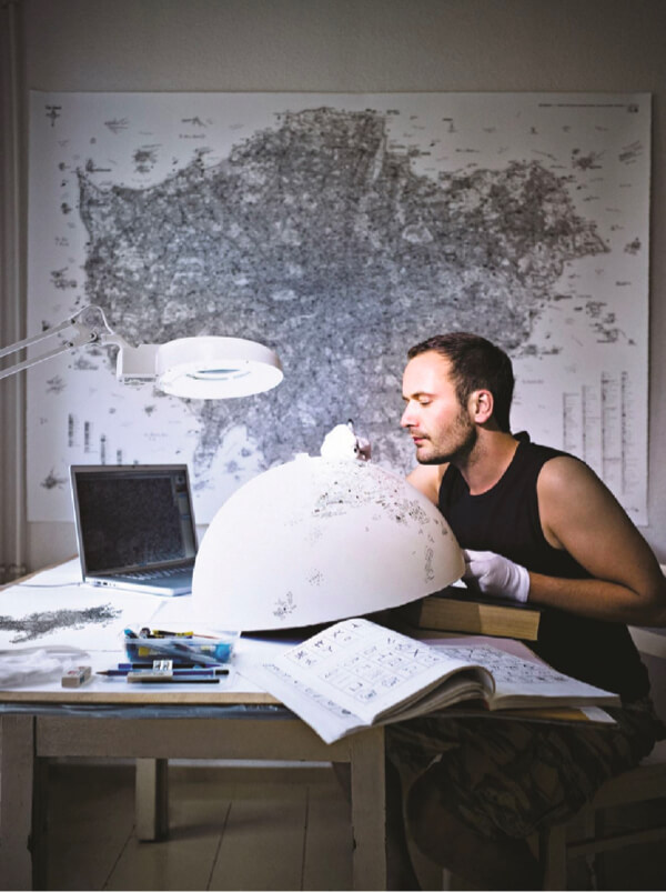
Whether highly finished or rough and weathered, natural materials and organic colours are still big news. Take a look at Baker Street Boys’ versatile range of furniture – each piece is completely unique and uses solid oak and untreated steel. Kia Utzon-Frank, currently a student at the Royal College of Art, disguised cakes as geometric marble structures. And Amtico’s stand beautifully detailed the process behind their ethereal new design.

Wallcoverings (from left to right): Tranquility, Harper, Arbour, Cezanne, Omega
Pastels
With pastel pink and blue forecast as the Pantone Colour of the Year 2016, we were expecting to see our fair share of pastel hues, and we weren’t disappointed! However, the shades we saw were towards the more vivid, saturated end of the pastel palette. Think macaron, rather than ice cream shades. We loved Elli Popp’s mystical new ParallelWorld wallpaper design and enjoyed Camira Fabric’s presentation of their new trend book.

Wallcoverings (from left to right): Interwoven, Axel, Coronado, Shoreline, Sirenuse
Gold and brass
Don’t get us wrong, copper is definitely still big news, but this year at Clerkenwell gold definitely dominated. Everything from 24 carat polished shades, to antiqued brass. Petit Friture hit the nail on the head with their range of quirky gold lighting exhibited at Design Fields. And it would be hard to talk about a metallic trend without a mention of Tom Dixon – this time with the new Etch Mini range.

Wallcoverings (from left to right): Cirque Stria, Eden, Brushed Steel, Kensho, Kota Silk
Tropics
Tropical prints are high fashion at the moment, and for the commercial market the tropical look is moving away from printed jungle scenes and towards tropical colour palettes… every tone of green from deep teals and forest hues to bright chartreuse, alongside splashes of scarlet and acid yellow. Abstracta’s customisable sound absorbing Airleaf panels were a highlight for us.

Wallcoverings (from left to right): Floral Trail, Sorrento, Bark, Malay, Eliza
Pink and Teal
Sometimes together, and sometimes independently, pink and teal were everywhere you looked this year. From upholstered furniture, to tiles, paint and an abundance of teal velvet. Another Brand exhibited their new Orlo mirrored surfaces at Design Fields, and Giles Miller Studio’s ‘billboard’ installations were dotted around Clerkenwell.

Wallcoverings (from left to right): Herringbone, Savvy, Cassina, Leaf Trellis, Fold
Worth a mention:
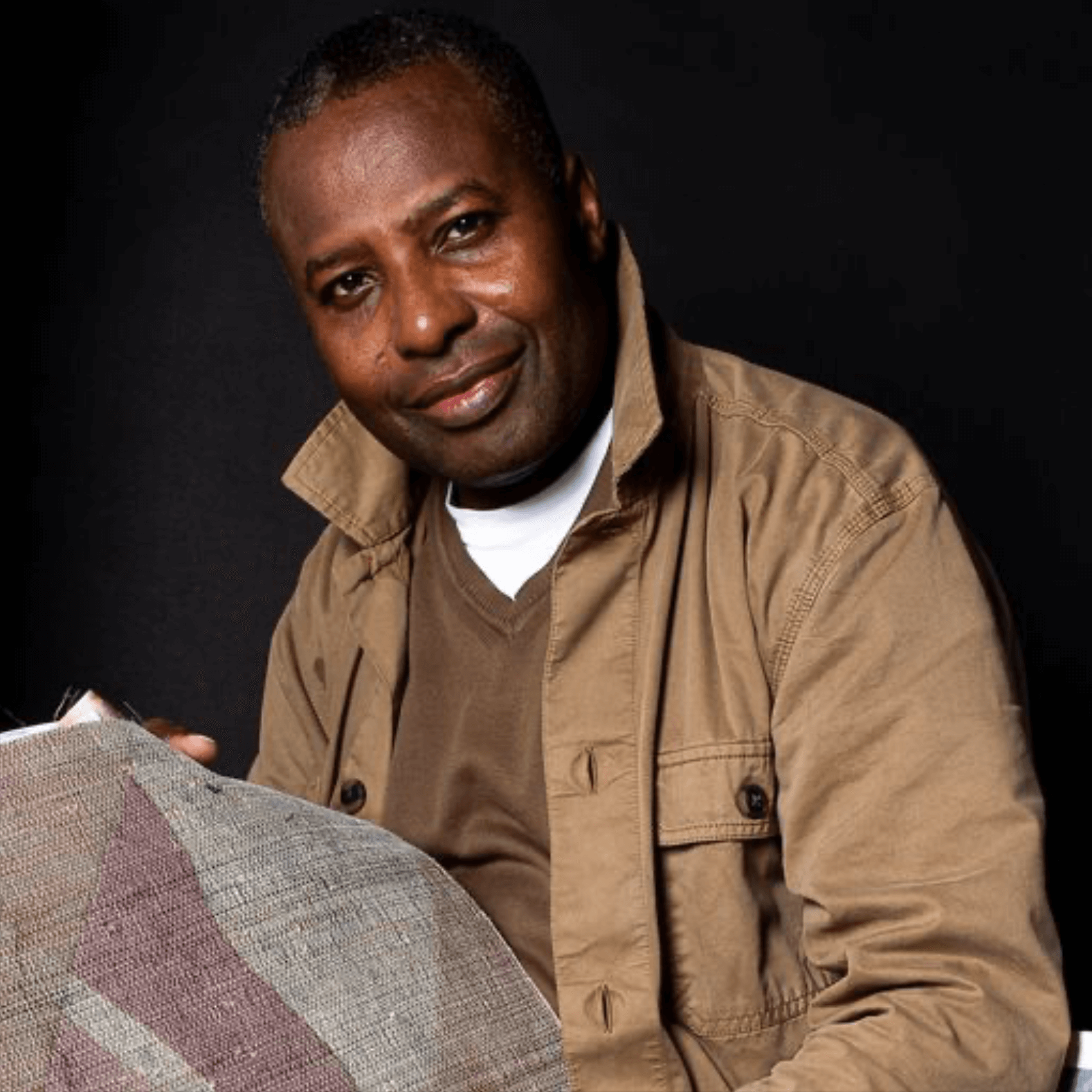
Archie Proudfoot

Traditionally hand painted and gilded signs which explore our relationship with language.
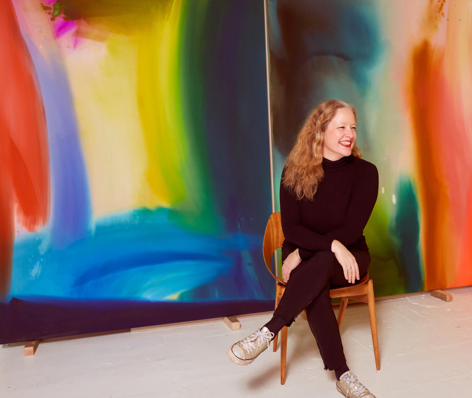
Ptolemy Mann

Showcasing her flare for colour and composition, Ptolemy exhibited her hand dyed and hand woven ikat rugs.
Tom Dixon

Tom Dixon transformed St James’ church into a co-working space and restaurant, displaying new designs against the backdrop of the 17th century interior.
Mustard

A colour that hasn’t been on the horizon for a while… mustard showed up a lot this year, and looked super fresh.
Watch this space for show round ups, trend reports and be the first to see our new designs. Please contact us for any further information or samples of any of our wallcoverings.