


5
Jun
19
Show round-up: Clerkenwell Design Week 2019
This year marked Clerkenwell Design Week’s tenth anniversary. We also exhibited for the first time as part of the British Collection exhibition in the stunning barrel roofed crypt of St. James’ Church. We take pride in designing and manufacturing all of our products in the UK and it was great to exhibit alongside such an exciting selection of home-grown design companies.
Meanwhile, our design team were out and about to scope out what’s new. Here’s a round-up of what we saw…
Biophilic Design

Biophilia is still the word on everyone’s lips, and the benefits of biophilic design are being increasingly utilised in office, education, healthcare and hospitality interiors. Biophilia brings elements and materials of the natural world in to the built environment for improved wellbeing, increased productivity and learning, decreased postoperative recovery times and higher rental prices in retail.
It’s been everywhere for the past few years, and the trend continues – we saw real floral elements used in patterns and surfaces, moss and living walls, botanical prints on fabrics and hard surfaces, plants on every available surface, extravagant floral displays and organic, green colour palettes with a hint of natural reds and yellows.
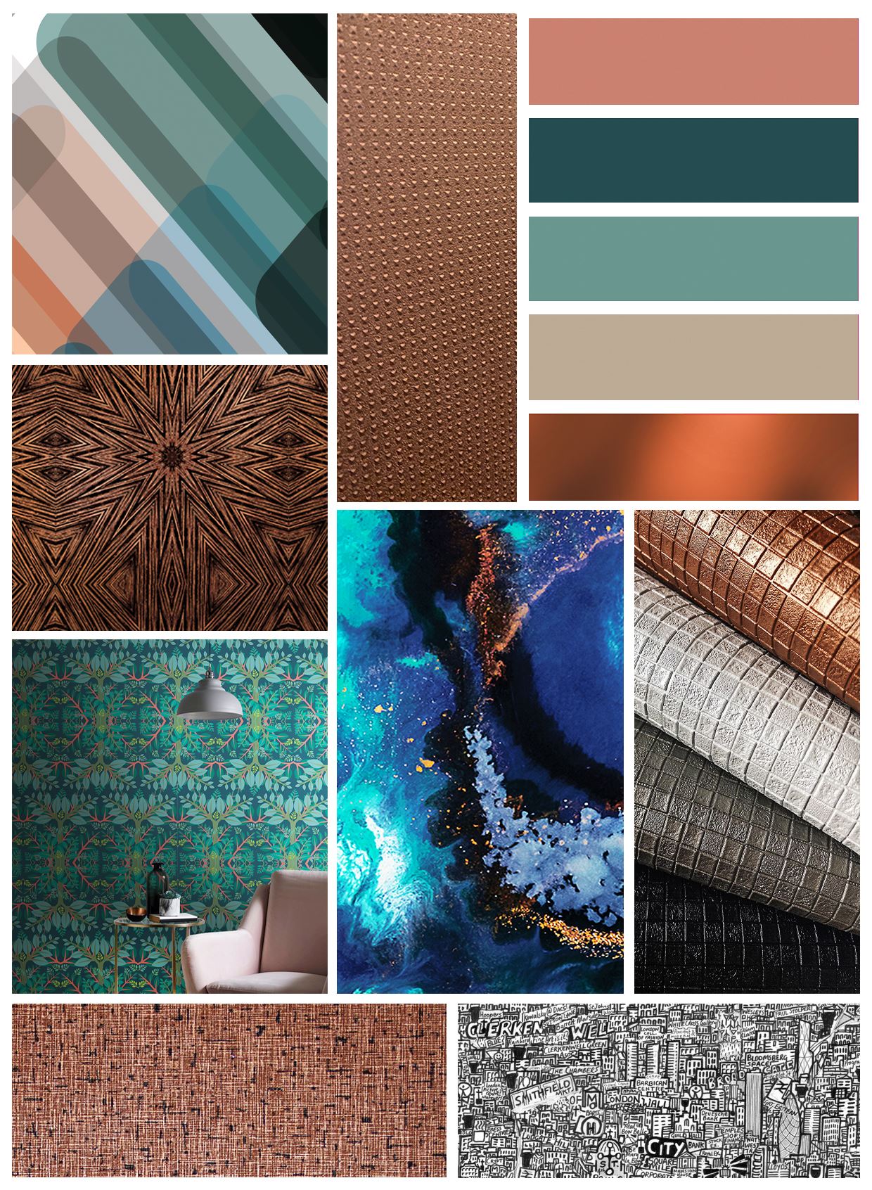
New Neutrals

The new neutrals are soft and calming, combined with simple pared back design, tonal geometrics, colour blocking. Pale powdery blues, chalky plaster pinks, warmed up greys, washed out terracotta and earthy pastel yellows against off-white, cream and barely there greys and beiges.
Geometrics

It’s no surprise that geometrics are still taking centre stage when it comes to print and texture. We found smaller scale designs with more intricate levels of detail – prints within geometrics, combinations of materials, overlapping pattern and distressed effects. Metallic tones led the way with a splatter of bright colour, soft neutrals, white and black and shadowy tones.
Chalky Pastels

Leading on from the New Neutrals this year we saw a grown-up version of ice cream shades being used as neutral background colours. Combinations of lilac and lavender, tea rose, pale peach, avocado, mint and lemon work their way seamlessly into new Nordic, art deco revival, mid-century modern, minimal and soft tropics looks.
Saturated Tones

Perfect for spring/summer, bright saturated tones often feature at Clerkenwell Design Week, and this year didn’t disappoint. From blocks of Pantone’s 2019 Colour of the Year, Living Coral and playful splashes of neon brights to four walls of vivid colour. Stay away from primary colours, however, and opt for combinations of more characterful tertiary tones.
Our stand


We gave CDW visitors a preview of wallcoverings from our summer collection, including industrial surfaces, textile embosses, mirror metallics and vintage tile effects. We will also be also introducing our new Designer collaboration with Leigh Bagley which features large scale rounded geometrics in contemporary, unexpected colour palettes. The collection launches at the end of July, so watch this space!
