


14
Feb
19
Round-up – Surface Design Show 2019
If you are an architect, designer, buyer, specifier or manufacturer then Surface Design Show is a must-attend event to source products, meet suppliers, network, learn from industry professionals, gain new insights and connect with innovative and exciting materials.
We saw a focus on experimental surfaces, innovative materials and fresh new colour palettes. Here is a round-up of our highlights from the show…
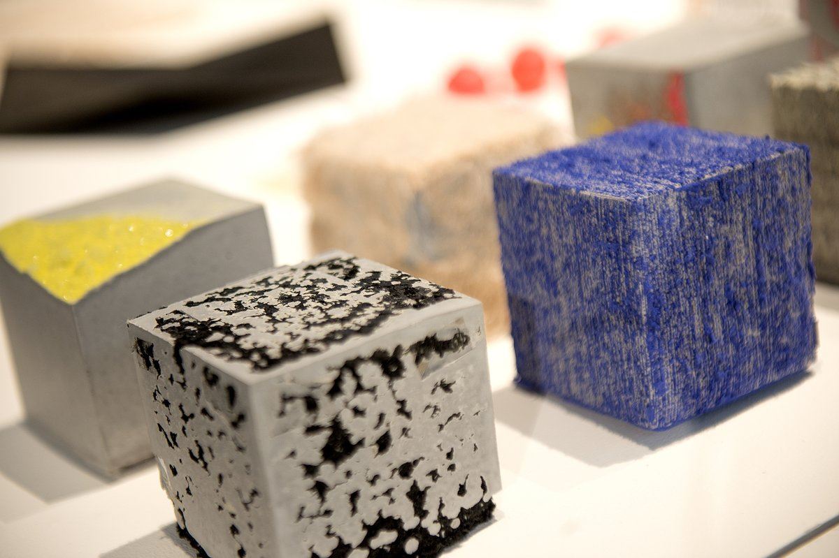
Engineered

Natural, recycled and familiar materials explored and re-engineered into new, innovative and intriguing surfaces with elevated properties. Vibrant, energetic hues including citrusy lemon and orange, zingy peach and fresh green, set off against a clean white background.
Warm Pastels

This soft, comforting look also includes innovative techniques for an air of futuristic adventure. The focus is on tactile matte surfaces and gentle, warm hues. The zingy peach carries through but the hero colour is the chalky pink. Pale mauve, powder blue, warm greys and transparent materials also make an appearance.
Organic Surfaces

This year’s organic surfaces saw new an ingenious ways to use natural materials. From moss, flowers and herbs compressed into fragrant panels, real bark tiles and charred wood to bespoke artworks and metallic effects.
Experimental

Sensory and experimental effects and one-of-a-kind creations featured heavily at this year’s show. There was a particular focus on postconsumer content, but we also saw unexpected paint effects, combinations of plastic and stone, large-scale textile artworks and bespoke surfaces in weird and wonderful colours, materials and textures.
2020 Spring Summer Trends from Colour Hive

Idyll examines the importance of ‘home’. In stark contrast to digital and political ideologies, Idyll facilitates a safe, warm, comfortable and familiar space. Utilising soft pastels alongside classic rich tones, Idyll’s colour palette gives a sense of nostalgia and comfort. Associated materials include rattan wicker, patinated brass, bas relief and inlay, suggesting heritage and restraint.
In contrast to Idyll, Kinship rejects the fantasy of home and examines ideas around community and shared living. Kinship challenges traditional values, questioning possessions in favour of freedom and sharing. The playful colour palette pairs zesty greens with salmon pinks, suggesting a sustainable and resourceful way of living. The material palette utilises repurposed plastics, upcycled fabrics, basic materials and flexible furniture.
Mask looks at the way we watch and are watched as well as how we determine what is real and unreal in today’s society. Playing with illusion, concealment and the artificial, Mask uses a cosmetic-based colour palette of soft blush and coral against deep black and brown. Translated to materials, mask encourages tactility utilising cellular structures, leather alternatives and glossy black paintwork, suggesting an overall feminine look and feel.
Representing fun and fantasy, Parade encourages more honesty, creativity and braveness. It is extroverted, eclectic, expressive and daring, utilising bold colours and playful materials. Think saturated, bright colours incorporating innovative paint effects, sparkle and shimmer.
See all of our wallcoverings to get the look and to see the full Colour Hive trends see Mix Magazine S/S 2020 here.